The enemy here is an abuse of skeuomorphic[1] design principles. The Reason and iBook examples are the most blatant abuses of this technique.
Buttons are a good example of skeuomorphic done right. In real life, if something's supposed to be turned, I expect it to be a knob. If something's going to be pulled, I expect there to be a handle. Since you're expected to click or tap buttons, it they should obviously look like buttons.
I think that Apple's decision to continue buttonizing touch UI was probably wise in the beginning, but seeing Windows Phone 7's all flat everything approach feels really fresh. Why don't they chrome up their touchable objects? Because its a _touch screen_ and the only thing you can POSSIBLY do is _touch_ them. The context is I took out my device to do something with it, I expect to be touching things.
So while buttons may still need to be buttons on the desktop, I'm happy to see chrome fade away in touch UIs.
But not everything is a button. Designers need to be extra careful when displaying non-interactive fields on the same page as buttons if they are going to remove UI chrome.
Twitter for Android is an example of how nonintuitive a flat interface can be. When viewing user profiles, you are presented with a list of information (name, bio, tweets, lists, etc). Clicking Name or Bio does nothing, but they are the first items listed and look exactly the same as every other item. (Actually, clicking them causes the item to highlight as if you were clicking a button, but there is not any associated action, so nothing happens.) When looking to see a user's tweets, it always takes a moment to remember that "Oh right, some of these words are interactive."
The Settings menu in Android attempts to solve this by greying out fields which do nothing (e.g., the Model field in About Phone). It works there, but the same technique could fail if your app also has potentially disabled buttons or important static information that shouldn't be grayed out.
Reason is fantastic. It's actually a fantastically intuitive interface for its target market, and what's more, it's psychologically effective.
The skeumorphism in Reason is so over-the-top – there's a physics engine in there! - that it gets you in the right mindset: it's playful, it doesn't take itself seriously, and that's exactly what you need to get making music. It's exactly the opposite of WriteRoom because it's serving a very different mindset.
I use Reason every day, and while I assure that its design was somewhat appealing at first, the sheer insanity of having to deal with virtual instruments and sequencers as if they were the "real thing" grows tiring extremely quickly.
Even during my education, wherein I dealt with more than a few individuals in Reason's "target market" (see: aging film composers who have spent their fair share of time plugging real cables into real sequencers) found it appalling and difficult to use.
The only reason I still use the program at all is because it has a few excellent patches built into it. The fact that I have to wade through the swamp of illogic that is its user interface remains one of most frustrating parts of my job as a media composer.
Also, one of the ironies in reason is that you quickly arrive at the point where you want to wire the relevant knobs and dials to one central virtual control surface, because scrolling up and down over 3 screens full of devices gets old rather fast.
But there is no such thing that I know of (in Reason4), so without a physical MIDI control surface you're effectively lost.
Disclaimer: I'm only a casual Reason user, perhaps I'm missing something. I also hear Reason5 has some improvements but haven't upgraded yet.
The problem I had with the article is he didn't prove that these interfaces impede functionality. I don't know the market well enough but you seem to be a user of Reason and the interface obviously appeals to you.
Same with iBooks. I know people who love the faux-3d book pages and who swear it enhances the experience for them. Perhaps the author has a point about them not being proportional but that would be a suggestion to make the effect more useful. Not a reason not to use it.
Skeumorphic design elements are, by definition, decorative elements that CAN enhance functionality. So even if they don't enhance functionality they're still acceptable as long as they don't impede it.
It's definitely not obvious, but there's only so much that you can make _obvious_ on such a small screen. Its important that cancel and done are obvious, as they're the primary action here. I think its important that you know you can delete some of this info, so the delete is buttony. Is it nice knowing that you can change the label of a phone #? Yep. Is it important? Not really, especially if the contact has only one number (probably the overwhelming majority of contacts). If you care and start poking around, will you discover it? Probably.
I actually didn't discover it. I had to look online to figure it out. Think too of how one would come across this screen. My goal was to add a home phone number. One doesn't think that you need to change "iPhone" to "Home" to add a phone number.
FWIW, you've just pointed to a howto article which describes it as "hard to find" - and they must have thought it was hard enough that people could do with some extra help before they wrote the article. You can't please everyone!
I can't remember how you would change an entry labelled "other" to "home" with that version of the interface. One benefit of the current one is that you change the field label in the in the same way that you set it the first time, so there are less "parts" of the interface.
1) I don't think 3-D looking buttons are a bad thing per se. I was actually thrown for a loop by the iPhone contact screen where to make a call you have to click on a flat and non-button-like half of a wiget.
2) Some times, I think 3-D shapes can guide the eye/ help the user make sense of a GUI.
3) I actually grab syrup bottles by the little handle. Does that make me a bad person?
While I agree to some extent I think that the physical appearance on touch devices is necessary. I think that a button needs to look like a button, because I can't just explore with my mouse and wait for a rollover effect to understand what's clickable. Also trial and error to find a link could be a pretty frustrating process.
There needs to be some way to show what is tappable but I don’t think that making all that look like buttons is necessary. If you look around iOS (especially on the iPhone or iPod touch) you will see that very few tappable elements actually do look like buttons, they don’t have to. Only potentially risky actions are brightly colored and look like buttons, for example “Send” or “Delete”. I would argue that it wouldn’t matter much if you were to ditch the gradients and shadows and just go with bright colors and rounded corners.
Not only is there some utility in skeuomorphs (to borrow another poster's reference), but they also excite the imagination. I've heard the opposite critique of iOS widgets, that their flaw is mimicking machine-panels rather than something else, more fantastic. That is part of the appeal of Windows Phone 7: that it looks like the panel of some device a bit further in the future.
As a friend says, "realism is the last refuge of a dwindling imagination".
Speaking of chrome, I wish you wouldn't resize my entire browser window when I open your image link in a new tab.
On a separate note, I hate the Windows phone examples he gave. My phone is a communication device - I expect that no matter what I'm doing in the OS, the clock, battery indicator, and my connection status ought to be visible.
Dwarf Fortress. By far the most complex game I've ever played, and yet the interface was simple.
The dozen-items menu you see on screen is just a block of text telling you the hotkeys. Nothing to click, push or drag, no focus to worry about, you just pressed keys away.
And once you memorize enough of them, you can just hide the big block of text and go completely UI-free.
No wasted space, no button hunting or "I didn't know you could right-click". Just you, the game, and the keyboard to translate your thoughts.
I wish it was possible to implement this in every software.
DF is a bad example, because of the learning curve. There are things that the UI could've done (especially if it left ncurses) that could make the game more approachable for new players.
I always thought the hardest part of the learning curve was understanding the game itself, not the interface. What each workshop does, why that dwarf have been in bed for two months, what pissed the elves.
Not saying it's perfect either, but what do you think the UI could have done better?
Having hotkeys onscreen is a great help, but being required to use them is still a terrible cognitive burden if you have lots of them and they impose modal effect(which DF does in spades). When you're "browsing" for actions to perform, it's easier to click on something when you see it than it is to see a keyboard binding and then find the key a second time on the keyboard - and it is a "find" on the keyboard because the muscle memory is going to be different from regular typing.
As well, the visualization style has fundamental limitations. The 3D structures are hard to understand well with flat 2D. You can learn what the icons are, but embedded within them is a small pile of properties that have to be enumerated separately. No health bars, status effect overlays, etc. This obfuscates a lot of the game's mechanics.
Now, this kind of severe chromatosis is particularly widespread in music-making applications, perhaps hoping to assuage the gear-nostalgia of composers who once had actual knobs and buttons to play with but now are reduced to pretending to operate pretend knobs and buttons on a screen. That's the only reason I can think of for this, a kind of glorious reductio ad absurdum of rampant chromiology, in Reason:
Actually, I know the designers of Reason. That product was extremely successful because it presented users with an interface that they already found familiar (dangling patch cables plugged into input/output panels on audio gear) whereas most competitors were presenting and interface they did not find familiar (signal routing as electronic schematics).
There are far more powerful programs than Reason for making music. But apart from Ableton Live (more modern, but until recently with much less control over signal routing), they are considerably harder to use and have a much steeper learning curve. I have 20 or 30 software packages like this (I used to work in this industry) and while many of them allow open-ended schematics instead of imposing this 'chrome' metaphor on the user, the downside of this is that reading other people's schematics or learning to organize one's own is difficult. A Reason schematic is easy to read quickly because you know where everything is, a lot of the choices have been made for you and you can focus on what's distinctive about it instead of spending the first few minutes trying to parse the graph.
At music biz trade shows, the probability that a vendor will speak of Reason dismissively as a 'toy' is inversely related to the quality of the UI on their soft/hardware. In an extreme case the 'software UI' turned out to be an IDE in which you could write Motorola 56k assembler. A year after the firm went bust the lead designer still claimed to be perplexed about why the music-making public had failed to embrace the product.
"The probability that a vendor will speak of <insert popular, easy-to-use software here> dismissively as a 'toy' is inversely related to the quality of the UI on their soft/hardware."
I think that could be said of just about every industry.
I agree, chromeless is nice. But I love Reason. I really enjoy being able to immediately introspect into the signal path, something which can be much more vague in other music apps. Ordering, layering, and combining effects are common practices in sound engineering/recording/performing to achieve different sounds. Being able to explicitly define the path in the chrome is actually quite handy.
While we're talking about DAWs I'd like mention that Ableton's Live features a much better approach with its UI - In my opinion it's one of the most intuitive interfaces in a complex and professional application. Everything is where you'd expect it to be, no nonsense, all flat.
Windows Phone 7 is, as mentioned, the other great example. When it comes to the user interface I'd replace my iPhone UI with WP7 without hesitation. I'd even go further and say that Metro is the UI that needs to be introduced to the next version of windows. Zune was a nice example of how this could work on the desktop. That said I hope Apple goes a similar way and finally drops that excessively shiny, glossy Aqua look. While the Mac is my favourite platform i don't think Apple deserves its reputation as inventor of cutting edge interfaces.
This is why I loved the Full Flat Absolute Black[1] and its brethren themes for Firefox back a few years ago, exclusively.
Sadly, the developer has not updated them in a long time (2008!), so one must go through the hackish method of updating the maxVersion by downloading, opening, and editing the addon oneself. Even with this, there are a few platforms it doesn't work on fully.
The field of music production does seem to be a bit of a magnet for this skeuomorphic UI business. Having people coming from physical equipment is part of it, but there is an aesthetic factor as well, which relates to the kind of people musicians tend to be.
However, there is a new generation of UIs appearing in music production software, and the German company Native-Instruments seems to be playing a big part in it. To contrast with the example of Ultrabeat from the article, consider NI's drum sampler 'Battery'[1] which arranges the same controls (plus some more) in a much more visually approachable manner, using strong, clean lines, and tabs to navigate between less-used controls.
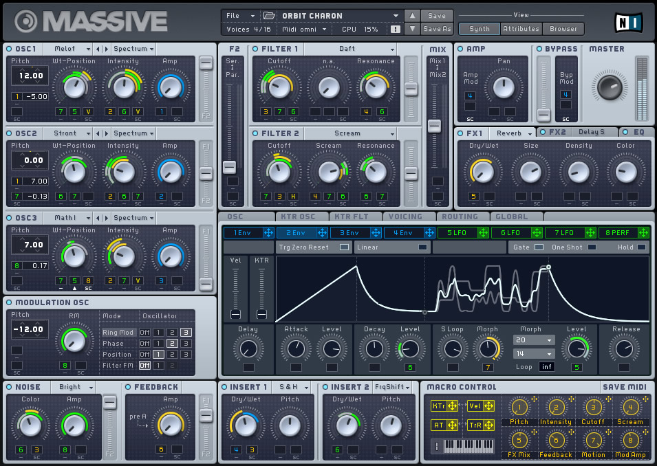
Similarly consider their synth 'Massive'[2], which also employs clean lines and visual simplicity, and employs a system of colour-coding and numbering to achieve what Reason does with it's cable spaghetti approach.
Also, I find the Windows 7 Phone UI to be really bland. It is about as far as you can go in the opposite direction from a UI which has some sense of real-world objects and forms, and I think somewhere in the middle would be more desirable.
I found it interesting that REAKTOR 5.5[1] and Sonar X1[2] are both upgrades that both tout an improved UI. Maybe a turning point has been reached? (After using Ableton, I can't imaging using the crazy "gear" UIs.)
If interfaces like reason's and ultrabeat's were the best UI possible for music software, then the interface for Final Cut Pro would be a rack of virtual VCRs and assorted machines, maybe even a bench for cutting and taping virtual pieces of film together.
When all you're doing is copying the physical device experience, it's the laziest UI design you can possibly make, completely ignoring the medium you're working with. Sure it works, just as well as the physical machines with a hundred buttons and knobs do, but it doesn't make use of all the possibilities a computer can offer. The best and the worst of the physical experience has been ported.
To me this is the same as emulating a rotary dial as a mobile phone's only means of dialing a number. It only sounds ridiculous because we all know the more efficient alternative. I think a lot of music software has yet to find the UI breakthrough it needs. Whenever that happens and a new standard of music software UI makes better use of the computer as medium, people will look back at UIs like reason's and find it very misguided.
That doesn't mean the answer to all UI issues is to go minimalistic like the article suggests, but I think real-life device mimicking is generally a sign of lack of UI/usability hard work. It's always the easier solution to copy the existing rather than think hard on a better solution nobody's done before.
Up until the last year or two, you had to use a mouse to interact with music software. Touchscreens existed, but were prohibitively expensive - the iPad is beginning to change that. Indeed, it's only within the last 5 years that processing multichannel audio hasn't hit the CPU so hard that the UI starts to get choppy (preventing complex animations of what's going on in the signal).
You will see some interesting multitouch applications within the next few years, but the real breakthrough will require some sort of 3d holographic display. Truly interactive musical creation requires the same sort of open-ended conceptual space as sculpture does.
Chrome should be all about making an application interface more intuitive to users. A completely reductionist UI would be just having hotkeys, like vim, but that makes it a lot harder for a new user to get started. I think the key is to strike the right balance so that as users gain experience, the Chrome doesn't hold them back.
Unless we're discussing actual metrics, it seems like it's a matter of preference.
Keyboard UIs (vim, pentadactyl, etc) should allow the user to do what they want in as few keystrokes as possible. They allow the user to do things fast. For people who want to take the time and effort to master an interface, they're superior to mouse centric UIs. For people who want to be able to sit down and use something right away without having to read a manual, they're horrible. The discovery of such UIs consists of "RTFM".
Mouse centric UIs should be easier for people who haven't used the program before. The functions should be fairly obviously labeled and easy to click on. For those unfamiliar with the program, at least its basic functionality should be immediately obvious. However, without some form of keyboard shortcut, they tend to be slower and more frustrating for more experienced or technical users who want to simply get stuff done.
All of this is just IMHO of course. I tend to prefer UIs that are essentially not there. My Firefox consists of a pentadactyl command line/status bar, and the TreeStyleTab sidebar. The browser UI is completely out of my way, and I know how to do what I want with just the keyboard, mostly. However, when people sit down and try to use my Firefox, they have no idea how the hell to even begin. (Whether this is a bug or a feature is up to you. :)
Having used Reason, Logic and a huge amount of audio software, I can only half heartedly agree with this post. Ultrabeat and some of Logics other instruments(sculpture) are indeed examples of how not to do a UI.
Reason, for me is probably the most intuitive application I have used since I initially was plugging hardware cables to make music. However, it certainly isn't the most efficient way to patch something, but with the huge amount of routing flexibility in that software, I don't see a better option, the context menu for cable patching isn't really an effective method either since its list can exceed the height of my screen in some cases.
I find though that most audio applications(reason included) do offer very flexible and easy linkage to hardware controllers which makes life easier. Most audio processing is about hands on control of many parameters simultaneously, and I think some of the best solutions(jazz mutant had some purpose built touch control surfaces) were much too expensive for the average user. I really hope that someone can make a tablet based app equivalent for iOS/android that could mimic these types of things. <shameless plug> (any software vendors want a dev(me) who would LOVE to work on this sorta project?!?! :)</shameless plug>
One other point that wasnt addressed properly in this article is that much of the "hardware look" UI chrome is due to these things being "emulations" of real gear. I think the market has decided that if you want to model a piece of gear, you had better draw up a photo-realistic picture of it and add some 3dfx to the knobs and sliders. For better or worse, a lot of users just dont buy into the sound emulation thing unless it looks like real device.
I have seen a lot of developers out there that have made some very functional very pretty UIs that also look like gear. U-he, FXPansion come to mind. Interestingly, Logic contains some very clean and easy to use UIs(the included efx) along with the dogs like Sculpture and Ultrabeat. Hopefully Logic10 will have a UI refresh to improve things...
A little off topic, but if you're looking for iPad touch control of things like MIDI devices, hardware is already out there to do that. Projects like touchOSC are providing the graphical instances, as well as others like S1MIDITrigger. This is getting bigger and bigger, and I imagine that's the reason Jazz Mutant packed it in - the writing was on the wall that the iPad is storming this market.
I've been using Reason since it was released (Dec. 2000 I think, so 10 years) and was using ReBirth prior to that. Actually, Propellerheads released an iPhone (and maybe iPad too) version of ReBirth that while not entirely functional on the iPhone form factor, is still fun to muck around with.
Main point: have to agree that Reason's approach to emulating hardware is a great deal for the home producer/hobbyist/traveling musician. I have a number of MIDI controllers which have all worked seamlessly with Reason... literally plug in via MIDI or USB and then you're physically manipulating the knobs in Reason.
Also one side note on the quality of Reason UI. About 5 years ago I was doing some work in Reason on a flight from Pittsburgh to Boston and and I got a tap on my shoulder. A member of the Fedora UI team just "had to know" what was this "incredible looking software?"
Having just started to play with audio software, I was wondering why on earth everything except Ableton Live had such crazy complex UIs. This is an interesting viewpoint, thanks.
Do you think this sort of UI is still important and relevant now, in 2011?
Abeltons UI is very clean and seems to be a good balance between power and readability. It seems that the trend is to clean things up though. Sonar X1 looks like a step in that direction, logic and Cubase seem to be trending that way as well.
I have some experience with real hardware, so I can understand the desire to emulate the look of a real device if you are trying to sound like it. I have also always been hopeful about the "future" of music apps and that maybe we should start moving forward more than looking towards the past.
Part of the problem is the fact that until recently much of the "vintage" gear was unattainable to the masses. Now that we can create 90-95% identical digital copies we seem to want to focus on recreating all the gear we couldn't afford. As for the new gear, we seem to have forgotten that we should create things that sound good, not something infinitely flexible.
Most importantly, I think the biggest problem with audio software is that features are emphasized over robustness. I wish that all of the vendors would step back and just spend 3-5 cycles making their apps stable.
Can I just say as a musician who fully endorses modular synthesis (and is the process of building his own physical modular synth) that Reason's design is fantastic. That's the back side of the instruments, you don't really interact with that much - only connecting various things which you don't really tweak. On the other side, yes, the gear matches physical interfaces and each instrument has a different interface. To me, that's the beauty of it! It really keeps your creative juice flowing and you end up doing things wrong and making mistakes, which unlocks all sorts of cool sounds.
Also, I don't really see the issue with Ultrabeat, for precisely the same reason. I don't tend to use that, but that's just because a drum machine isn't my workflow.
I think the author would have got his point across better if he wasn't using creative software as his example.
His first argument is a functional one: surely computers can give us a better way to manipulate audio than dragging around virtual patch cables. I totally agree with that.
However, then he tries to pivot the argument towards modernistic design sensibilities. Modern can be beautiful, but it can also be cold. And, like tactile interfaces, it's not immune from the eventual fatigue of seeing it everywhere.
In the end, the classic rule of form following function still applies. Make it work, then make it beautiful. As long as they don't impede function, I welcome the different looks and my occasional dose of nostalgia.
I think the classic rule of form following function doesn't have to do with doing one then the other. Rather, I believe it refers to the beauty of something which is built to be highly functional (e.g. higher mathematics, the piano, poetry(?)). In this case, aesthetics are functional.
I really like that integrated viewpoint. I'd always thought it to mean that "form follows function" in order of priority (rather than chronologically in development). But I really like the idea that beauty is the byproduct of functionality. That's a new spin for me.
I think the examples here are poorly chosen - wouldn't it be more interesting to compare the relatively chromey iOS interface to Windows Phone 7 (rather than an archaic Logic plugin released in 2004)? If we're bringing up old audio software, why not bring up Ableton Live, which has been on the forefront of chromeless GUI design for nearly a decade?
Also, Android's Honeycomb interface shows us that "chromeless" doesn't necessarily equal "flat".
There is a reason why forum software looks dated compared with commenting system in blogs. Old style forum designs do too much work with the chrome. Heavy, styled, boxes. It makes a design weighty and draws attention from the content.
Software designers use visual metaphors to make software easier to use. One of the reasons Apple has been so successful is their UI elements remind us of things in the real world. Like the now popular on-off switch from iOS. That could have easily been accomplished with a drop down or a checkbox, or radio buttons... but the useful video metaphor lets the brain think less to use it.
So, I have to disagree with the author. Im not against using relevant visual metaphors. Im against stupid ones (like the messy cables).
Buttons are a good example of skeuomorphic done right. In real life, if something's supposed to be turned, I expect it to be a knob. If something's going to be pulled, I expect there to be a handle. Since you're expected to click or tap buttons, it they should obviously look like buttons.
I think that Apple's decision to continue buttonizing touch UI was probably wise in the beginning, but seeing Windows Phone 7's all flat everything approach feels really fresh. Why don't they chrome up their touchable objects? Because its a _touch screen_ and the only thing you can POSSIBLY do is _touch_ them. The context is I took out my device to do something with it, I expect to be touching things.
So while buttons may still need to be buttons on the desktop, I'm happy to see chrome fade away in touch UIs.
[1]: http://en.wikipedia.org/wiki/Skeuomorph